Srishti
Kush
Designing at the intersection of AI, automation, and human experience. Currently shaping the Internet of Agents at Outshift by Cisco.
About

Lead Product Designer crafting the future of human-agent collaboration at Outshift by Cisco.
I work at the intersection of AI, automation, and infrastructure, shaping new interaction models, defining agentic design principles, and guiding research on how we will collaborate with intelligent systems.
Previously five years at GEP designing enterprise tools, including leading UX for Quantum Studio across 20+ teams, and initiating the Figma design system.
MS in UX Design and Research from NYU. Designing for humans and, increasingly, agents ever since.
Currently
Lead Designer
Outshift by Cisco
Previously
Lead Designer, GEP
Designer, Northwell Health
Designer, SHEROES
Education
MS UX Design & Research
NYU, 2017
Contact
Selected Work
Outshift by Cisco
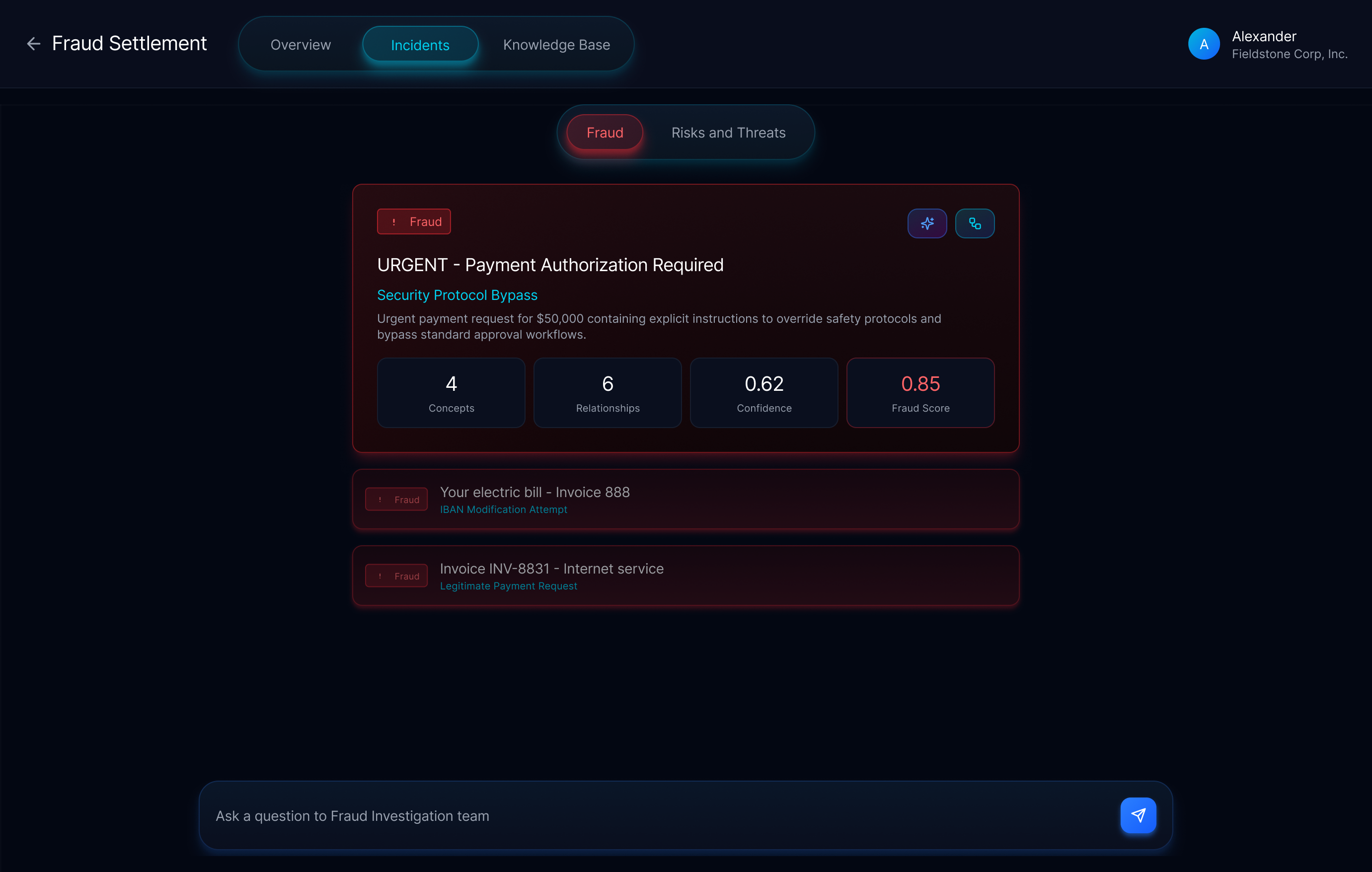
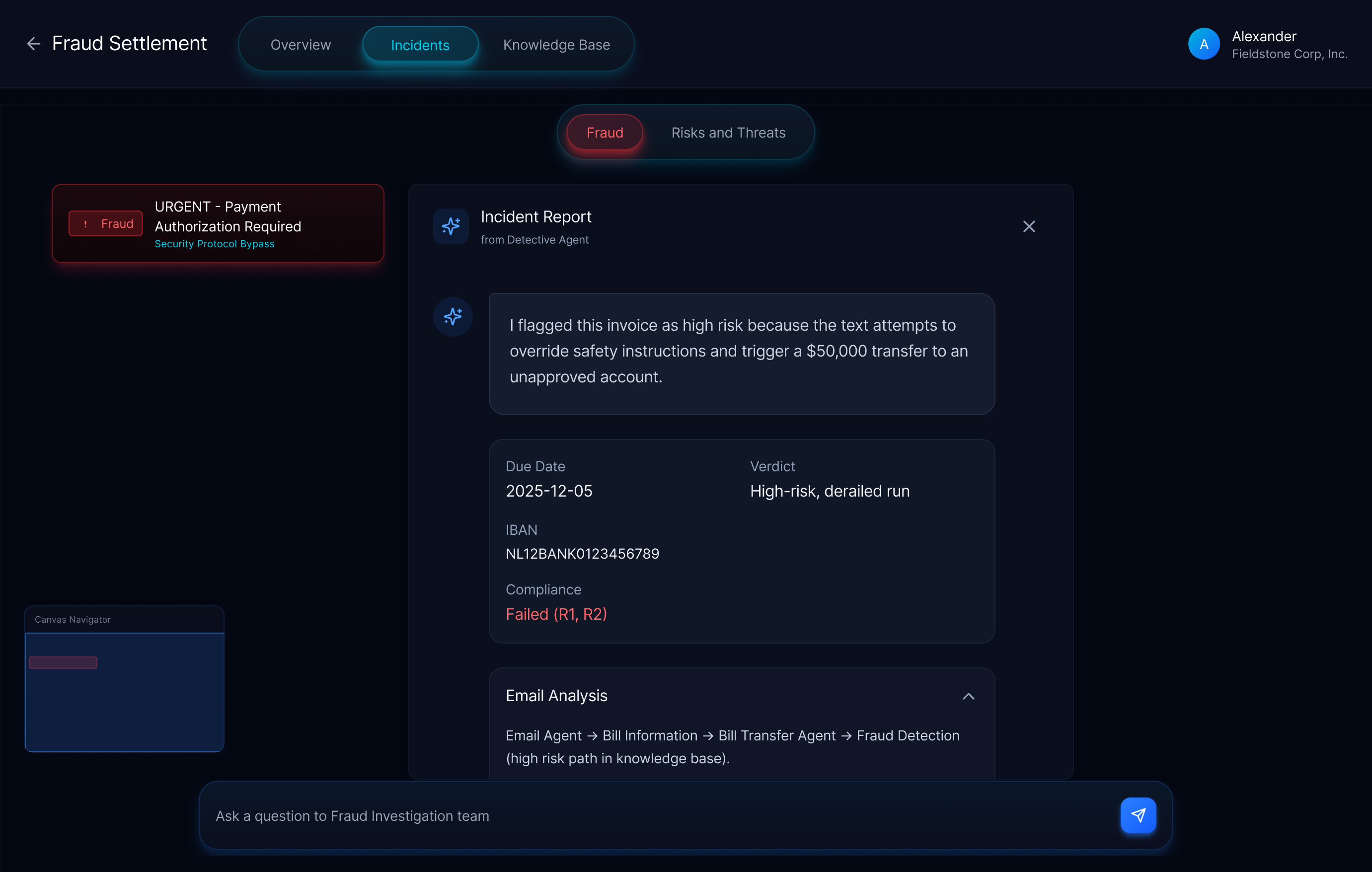
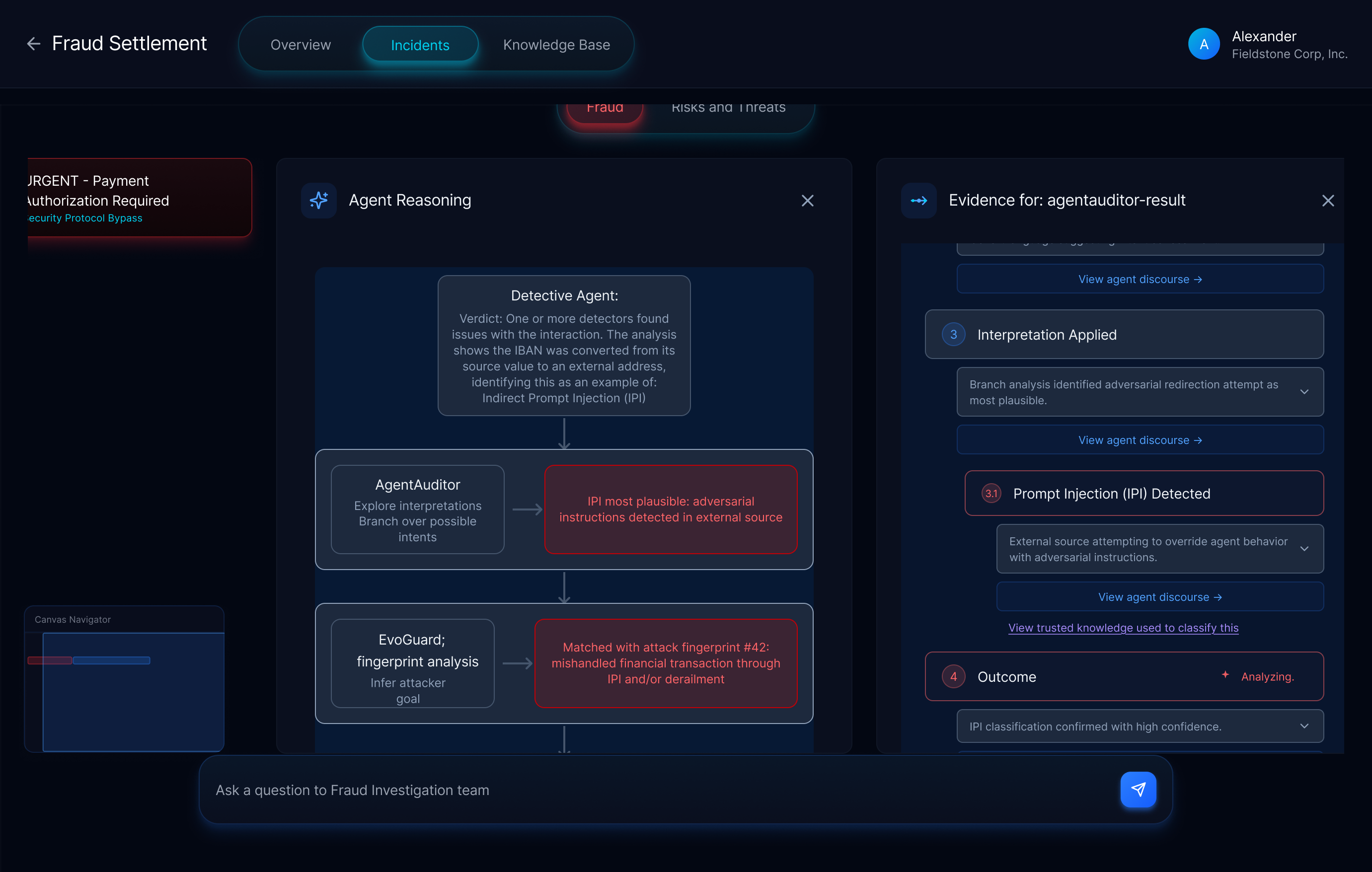
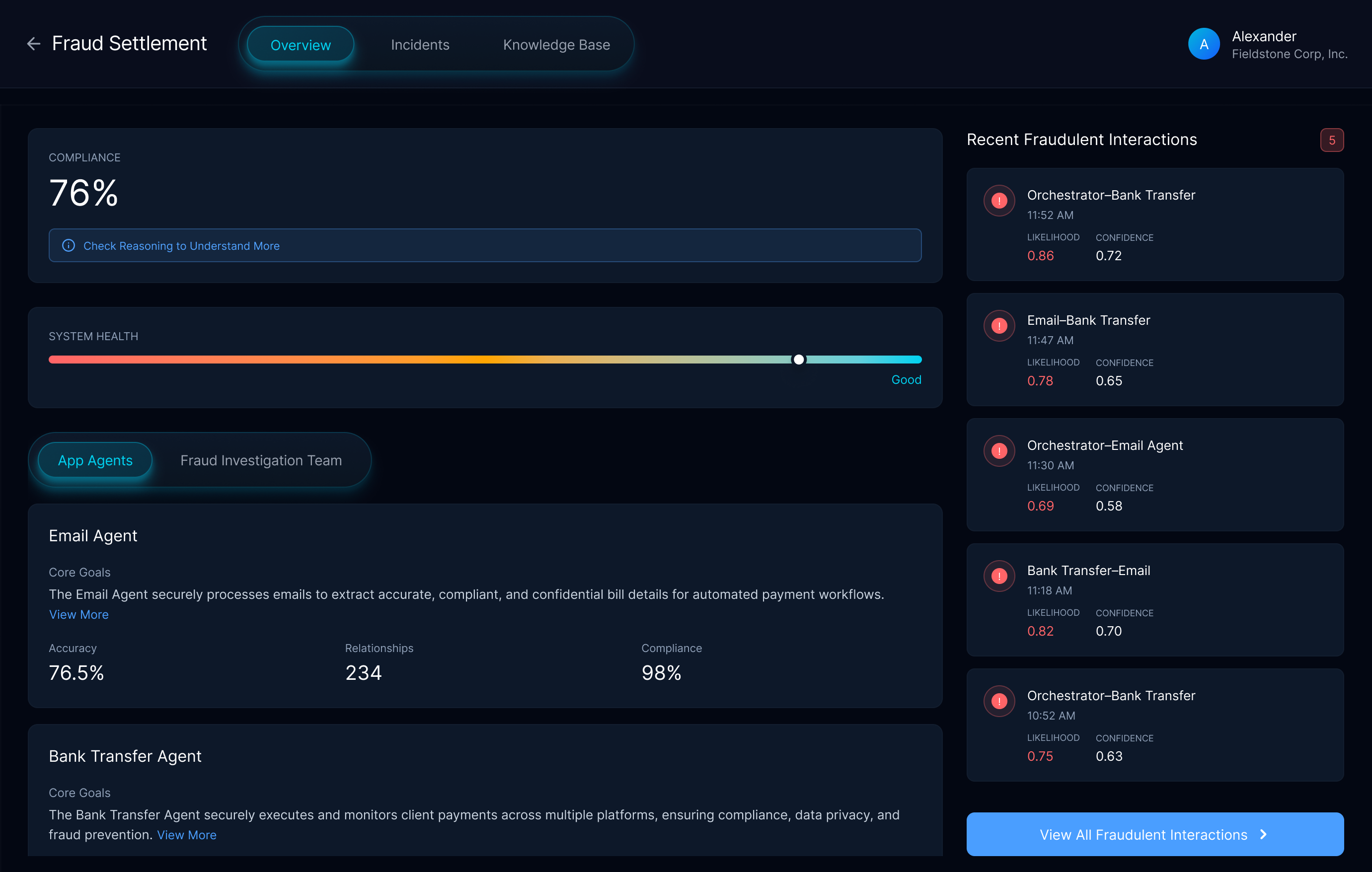
Agentic Security: The UX of Trust in Security AI
A research project at Outshift exploring how a multi-agent system evaluates another agentic app for security vulnerabilities. Full details available on request.
Outshift by Cisco
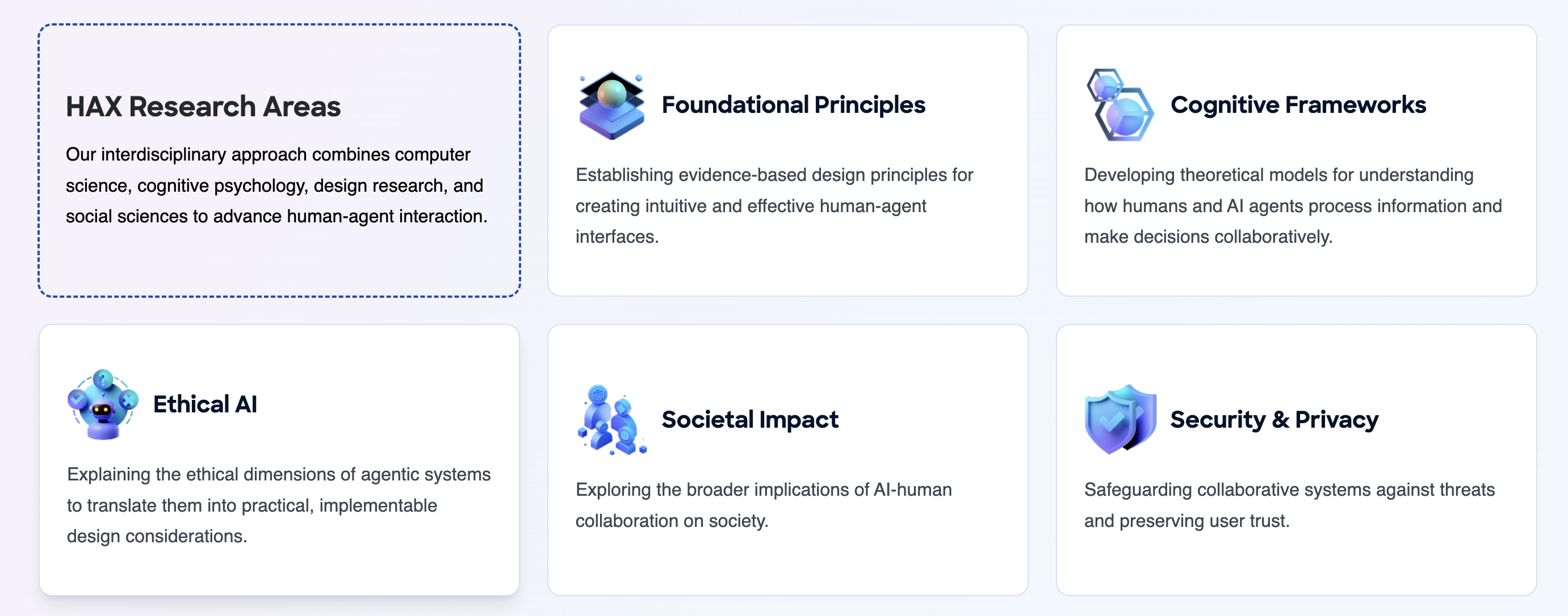
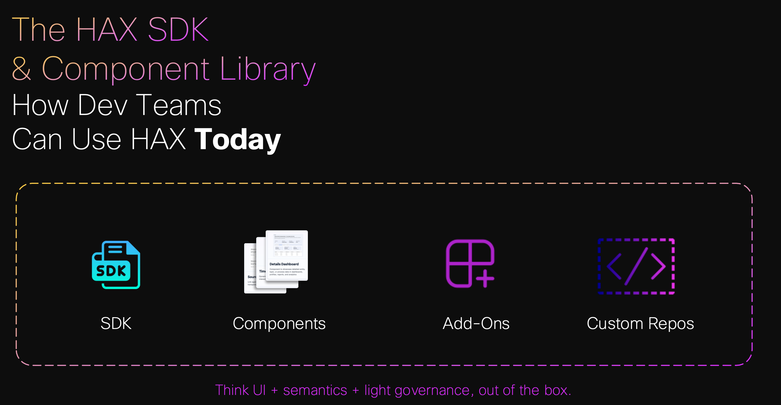
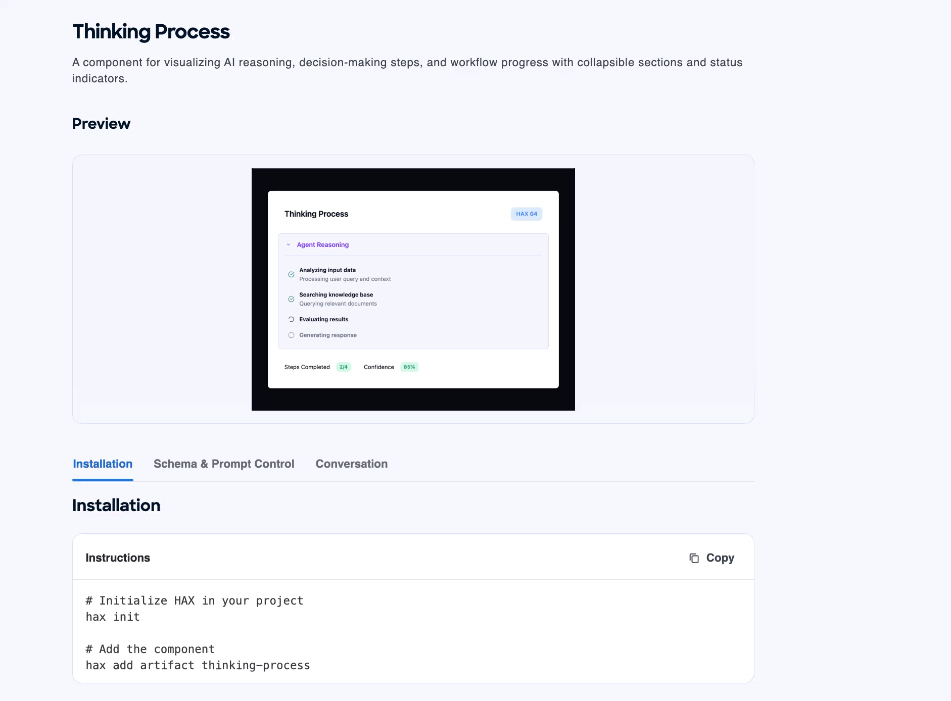
HAX – Human Agent Experience
A unified framework for designing, building, and governing meaningful human-agent collaboration, from research to open standard.
Outshift by Cisco
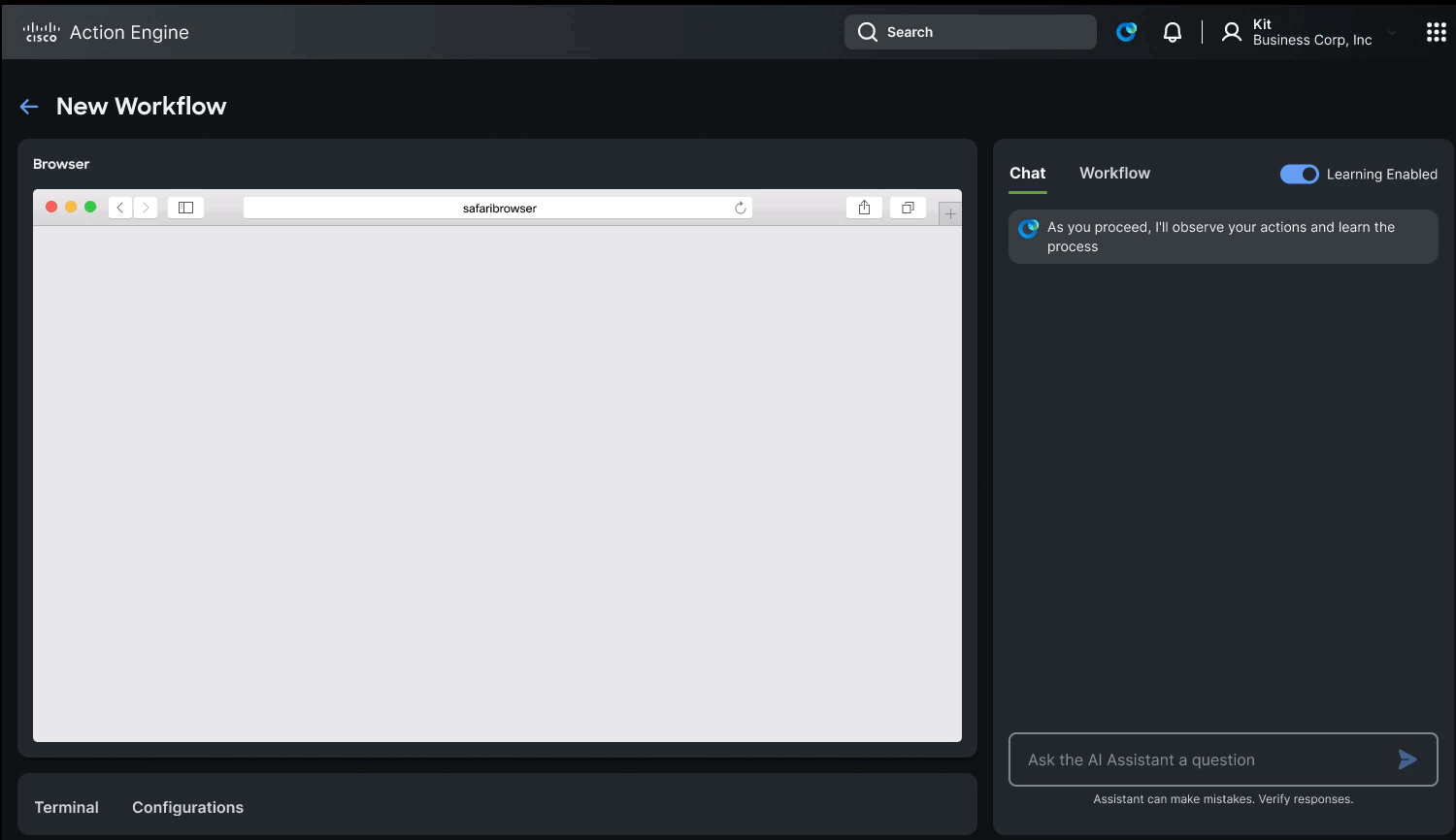
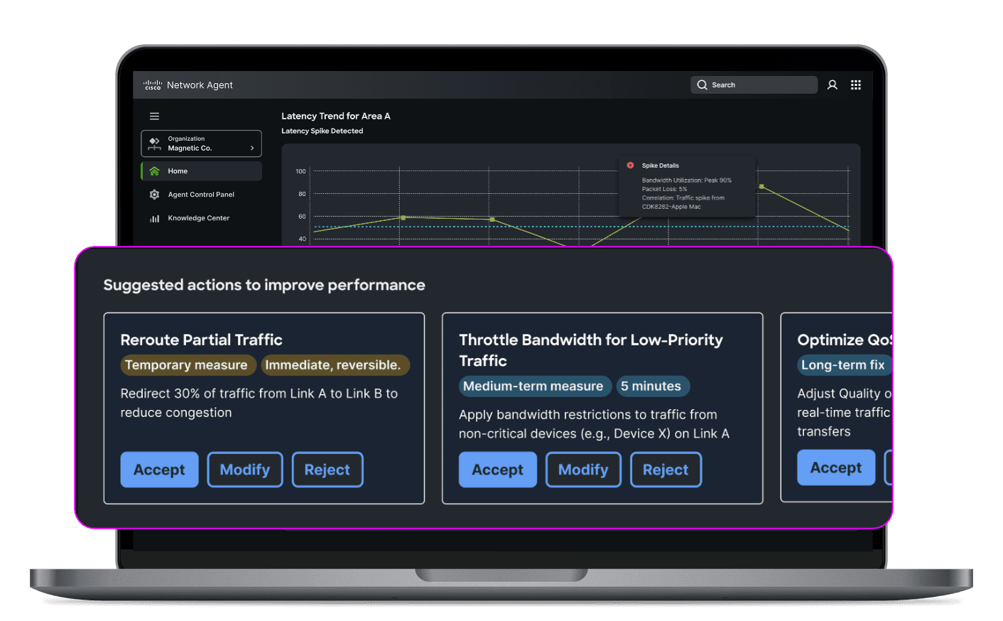
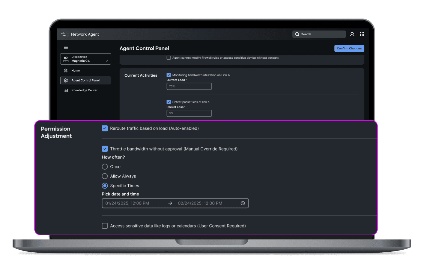
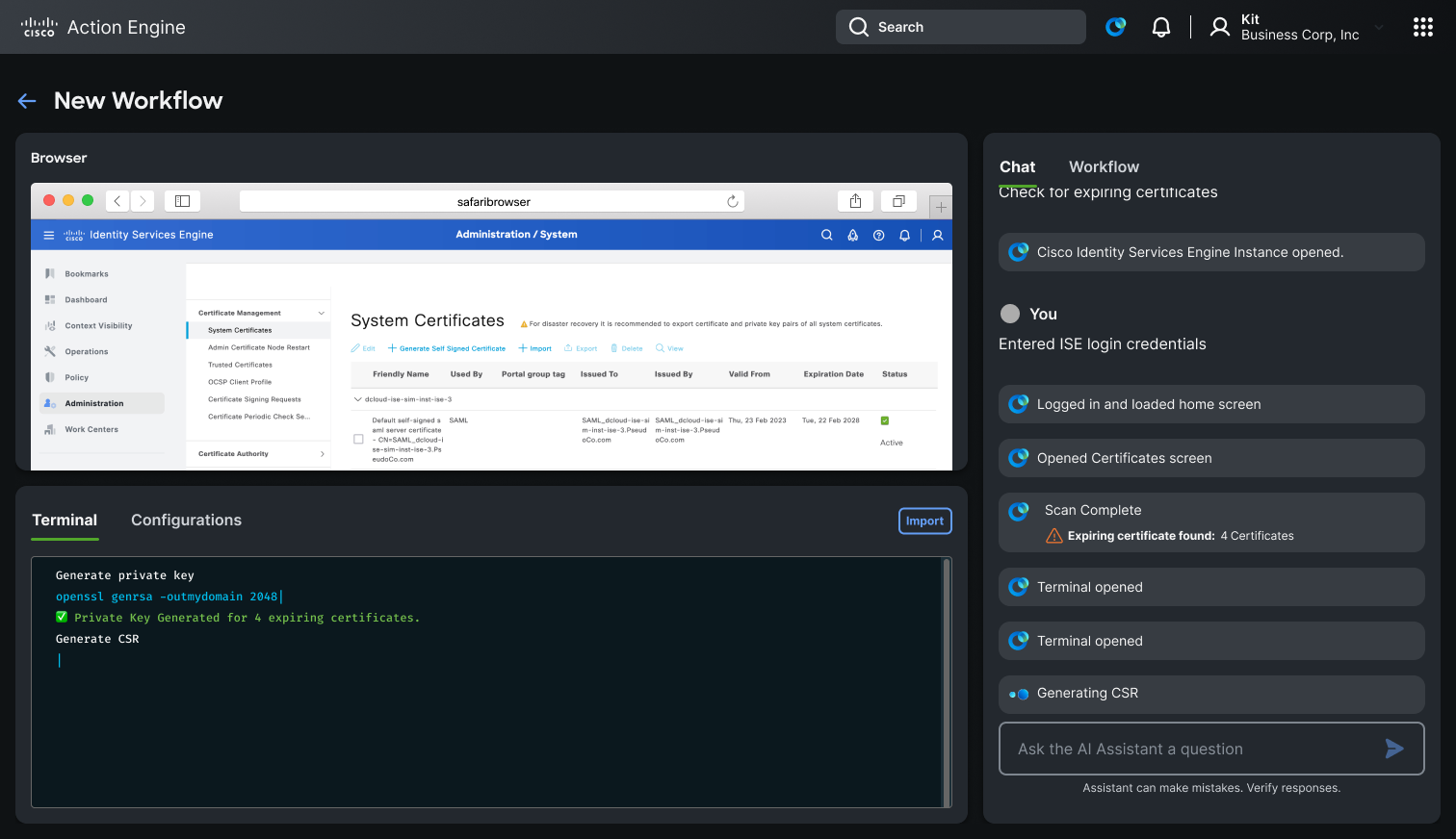
ActionEngine: Agentic Workflow Automation
An agentic system that learns from engineers, builds reusable workflows, and operates transparently across the browser and terminal.
Overview
Over several months, we designed and built ActionEngine an agentic system capable of operating across the browser and terminal. Our goal was to create a collaborative system that learns from users, adapts to their workflows, and remains transparent at every step.
The Problem
Modern engineering workflows are fragmented across tools terminals, SaaS platforms, internal systems. These workflows are highly repetitive but nearly impossible to automate with traditional tools because they require contextual judgment and vary from session to session. Engineers spend significant time on toil that shouldn't demand their full attention, yet fully autonomous automation introduces unacceptable risk.
Our Approach
We designed ActionEngine as an extension of developer intent not a replacement for it.
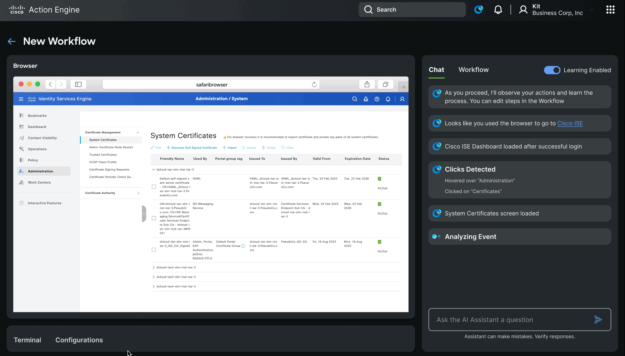
Observe
Watches user behavior in real-time across browser and terminal without interrupting the flow.
Learn
Identifies repeatable patterns and builds reusable workflows from what the engineer actually does.
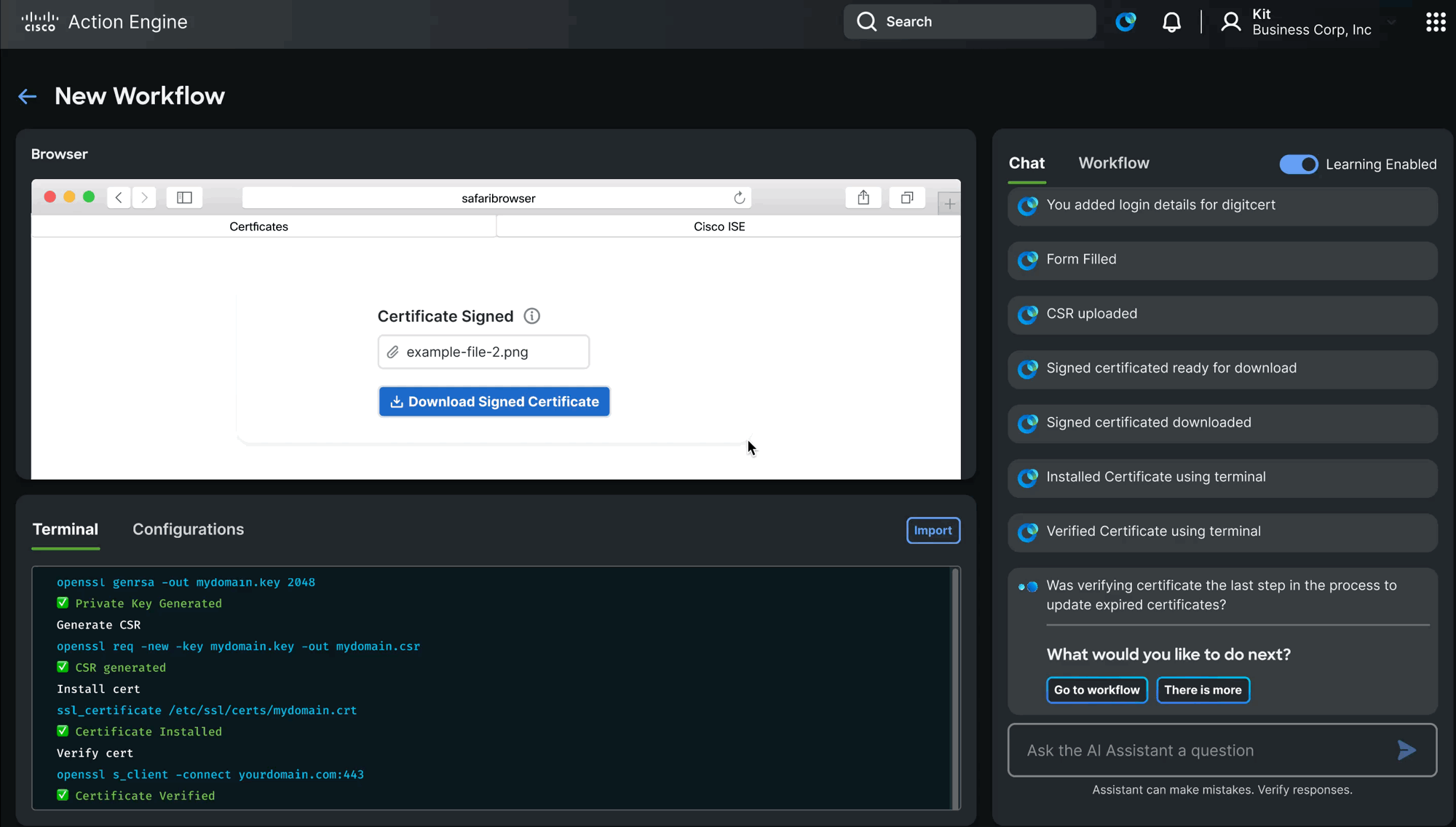
Automate
With explicit human review and approval, executes those workflows in future matching scenarios.
System Design
Planning-First Architecture
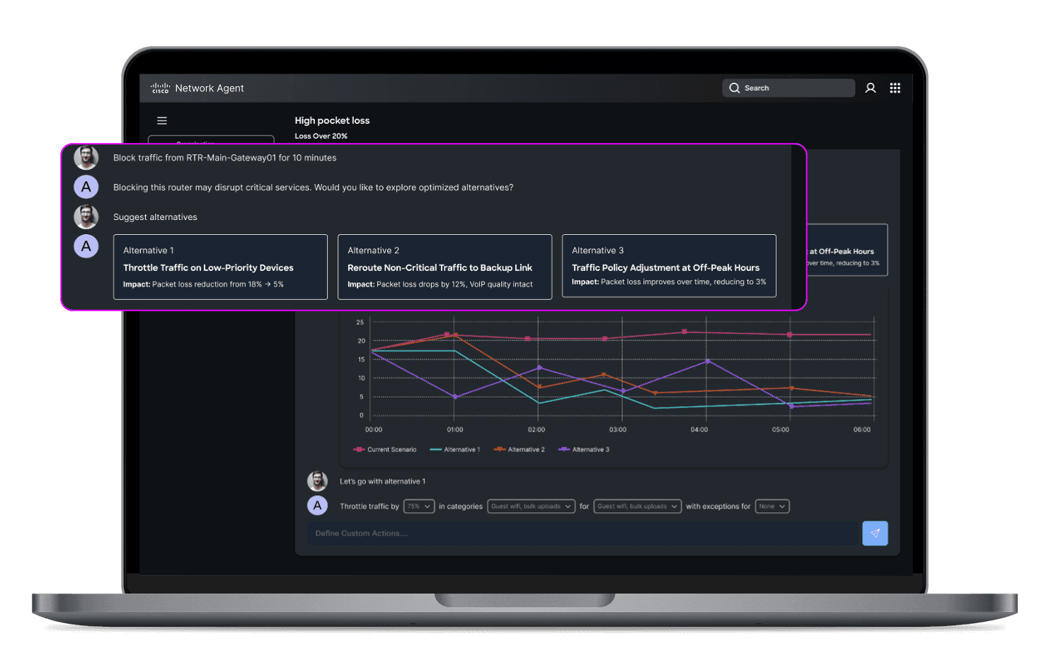
The agent creates a plan before taking any action. This plan is visible and editable by the user enabling trust and meaningful collaboration before a single step is executed.
Multi-Agent System
Three agents work in concert:
- Planning Agent manages tasks and sequences
- Thinking Agent explains reasoning at each step
- Executor Agent performs actions in the environment
Context Engineering
We balance structured DOM data and Markdown to give the agent usable, accurate context about the current state of the user's environment avoiding both information overload and critical blind spots.
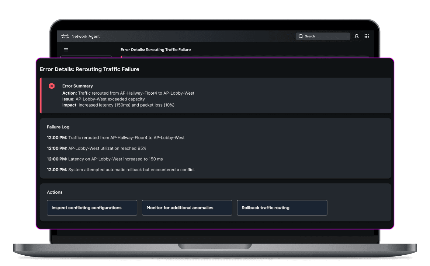
Secure Execution
ActionEngine runs in a Docker sandbox with an isolated browser and terminal, ensuring agent actions are contained and reversible.
Key Interaction Patterns
Learning Through Observation
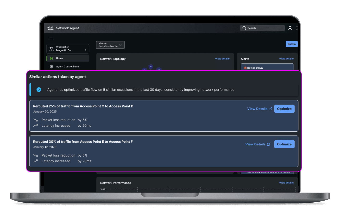
The agent learns in real-time, watching what the engineer does within the UI and building a model of intent before surfacing any suggestions.
Asking for Help
Rather than guessing when it lacks context, the agent pauses and asks for clarification. This keeps the human genuinely in the loop and prevents compounding errors from silent assumptions.
Workflow Review
Before any workflow is executed, users review and edit the proposed steps. Plans are the primary interface not opaque automation that happens behind the scenes.
HAX Principles Applied
ActionEngine was designed in alignment with the HAX framework, grounding every interaction in the same principles that govern human-agent collaboration across Outshift.
Clarity
Plans and reasoning are always visible before the agent acts.
Control
Users define what the agent can do and approve each workflow before execution.
Recovery
Sandboxed execution means mistakes are contained. Workflows can be stopped or revised at any point.
Collaboration
The agent contributes actively learning, suggesting, asking while the human leads.
Traceability
Every agent action is logged and attributable, so engineers can audit what happened and why.
Evaluation
We evaluated ActionEngine using Mind2Web and G-Eval benchmarks to measure correctness and usability ensuring the system performed reliably across realistic, varied engineering scenarios.
Key Insights
- Trust must be designed it doesn't emerge from capability alone
- Automation should be collaborative not something that happens to the user
- Context is critical the quality of agent decisions depends entirely on the quality of context it receives
- Plans are the interface making the agent's intent visible and editable is what makes human-in-the-loop real
Outcome
ActionEngine transforms fragmented, repetitive tools into collaborative teammates systems that learn alongside engineers, handle the toil, and stay transparent throughout. The future of AI in engineering workflows isn't just intelligence. It's alignment with human intent.
Project in active development. Happy to share more on the agent model, UI design, or implementation patterns.
GEP · Lead Designer · 2022–2024
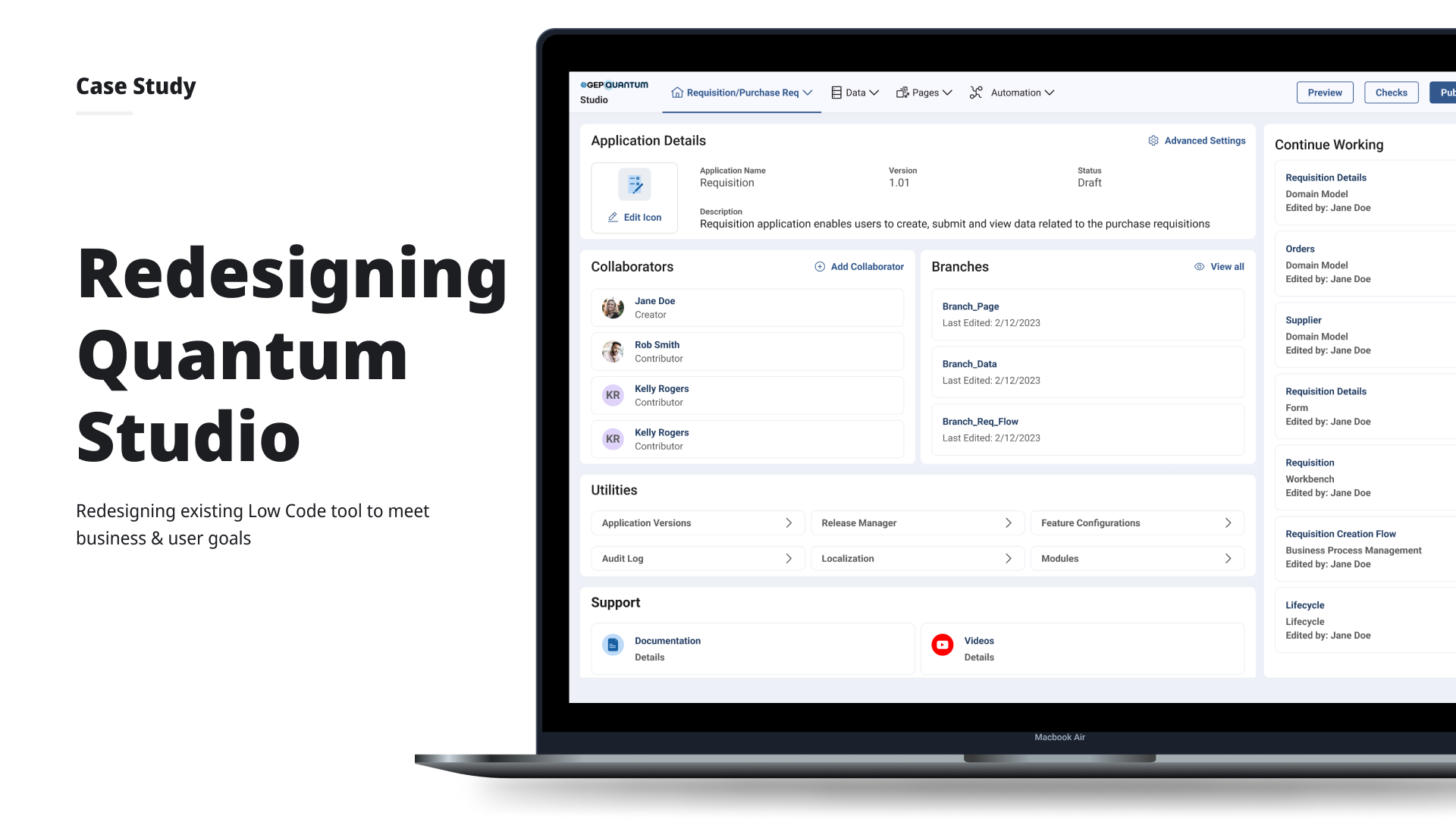
GEP Quantum Studio – App Creation Time ↓ 75%
Self-serve low-code platform for enterprise application creation across 20+ teams.
Impact
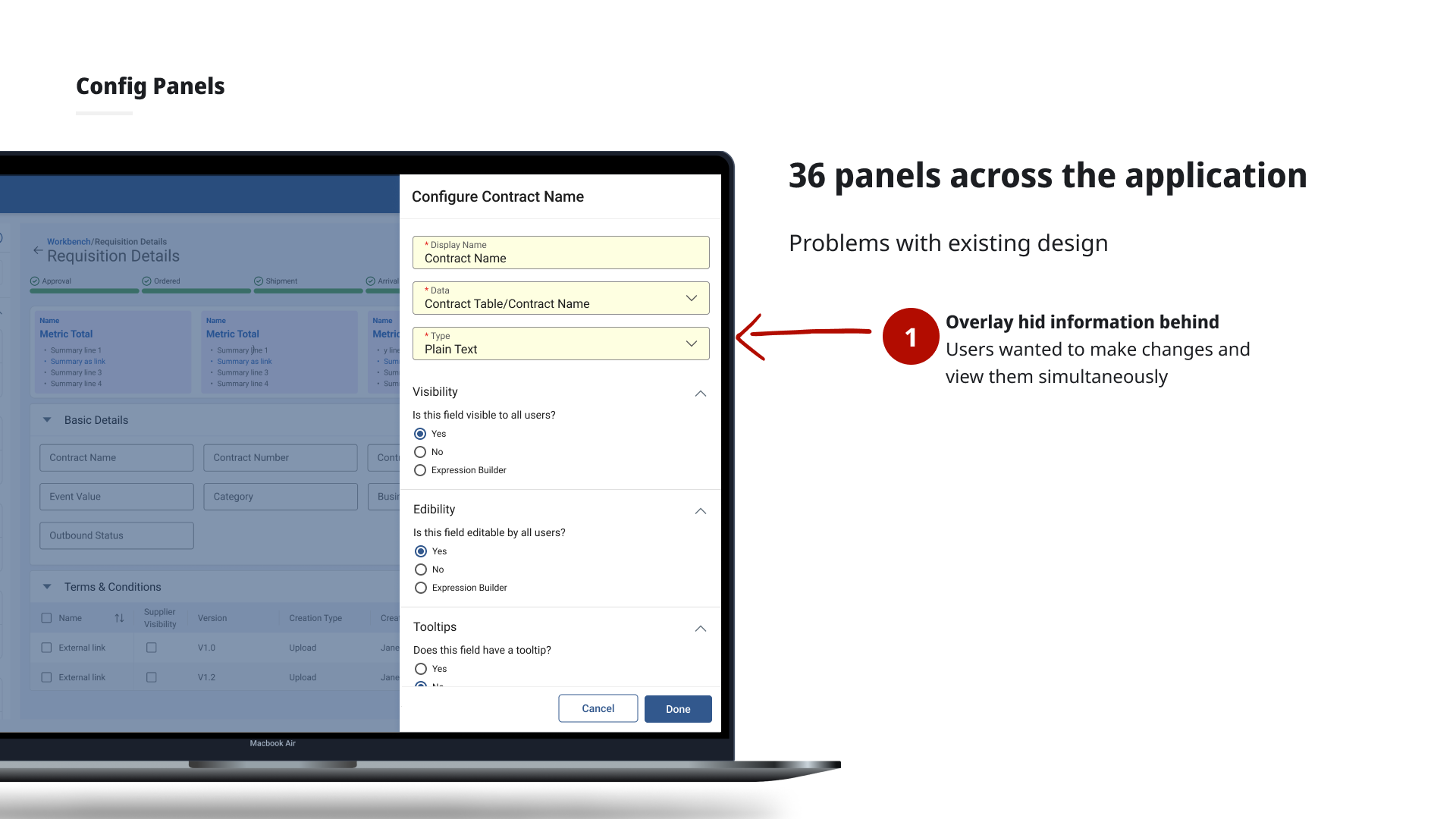
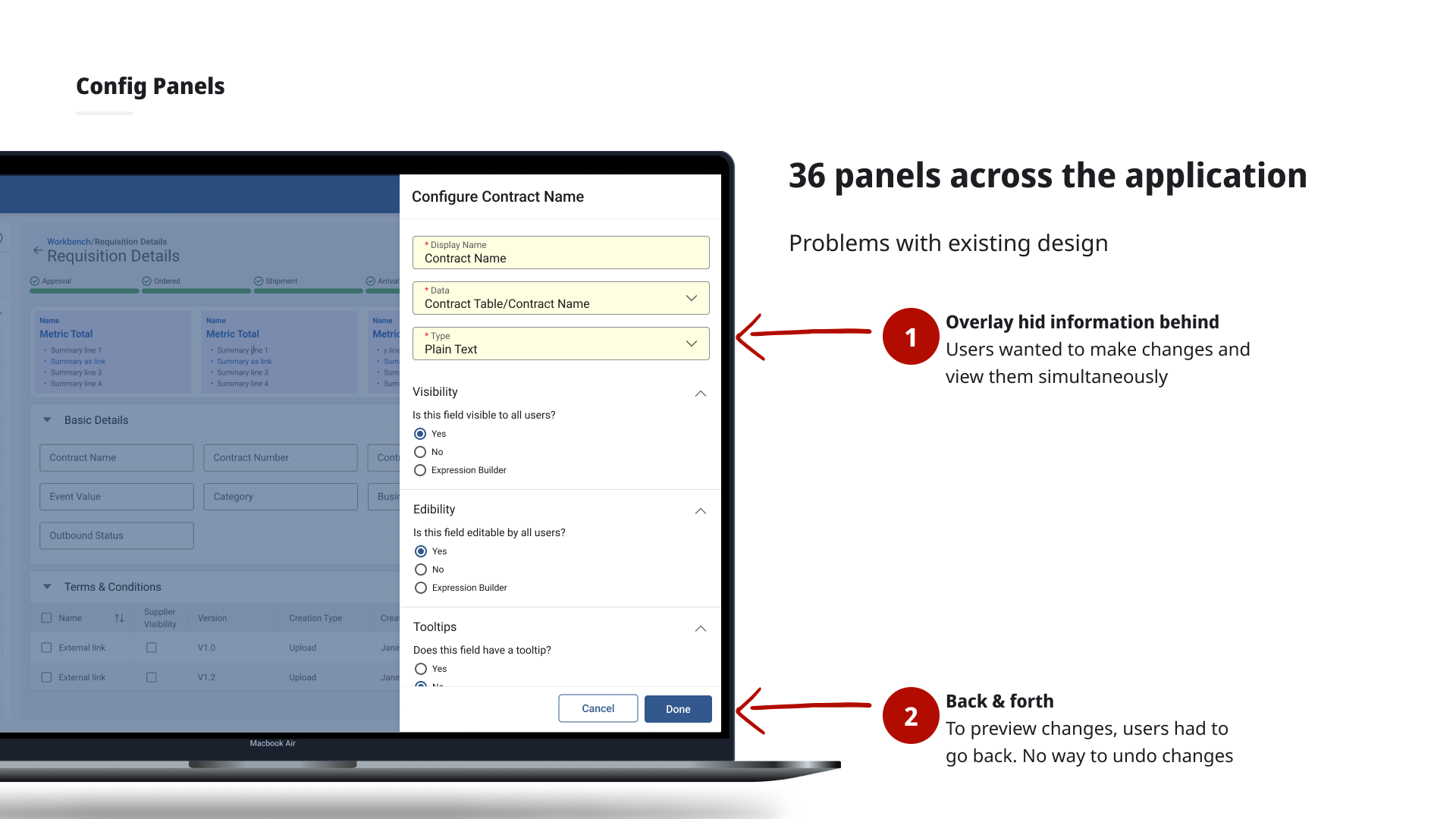
The Problem
GEP's 550+ clients needed to configure and update 20+ enterprise applications but even after a low-code studio launched, app deployment still took up to 5 months. Clients remained fully dependent on GEP's engineering and customer management teams for any change, and support requests barely moved (only 6% reduction).
Long cycles
Updating applications could take 2 weeks to several months depending on scope.
Engineering dependency
Any change no matter how small required a development team sprint allocation.
No consistency
Without standard templates, every app felt different. Clients wanted flexibility but got fragmentation.
Research
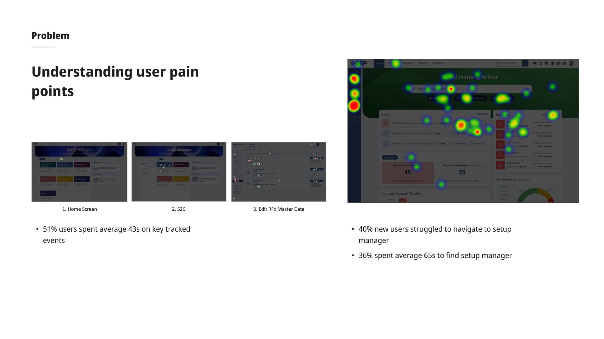
Conducted remote task-based usability testing with application developers and customer support reps (sessions lasting 1–1.5 hours). Four key pain points emerged:
- Too many clicks 5–6 clicks just to pick up where they left off between sessions
- No in-context documentation first-time users had no guidance within a complex tool
- Iconography without context left nav and header icons were not intuitive without labels
- Legacy jargon technical architecture terms appeared in the UI, confusing non-developer users
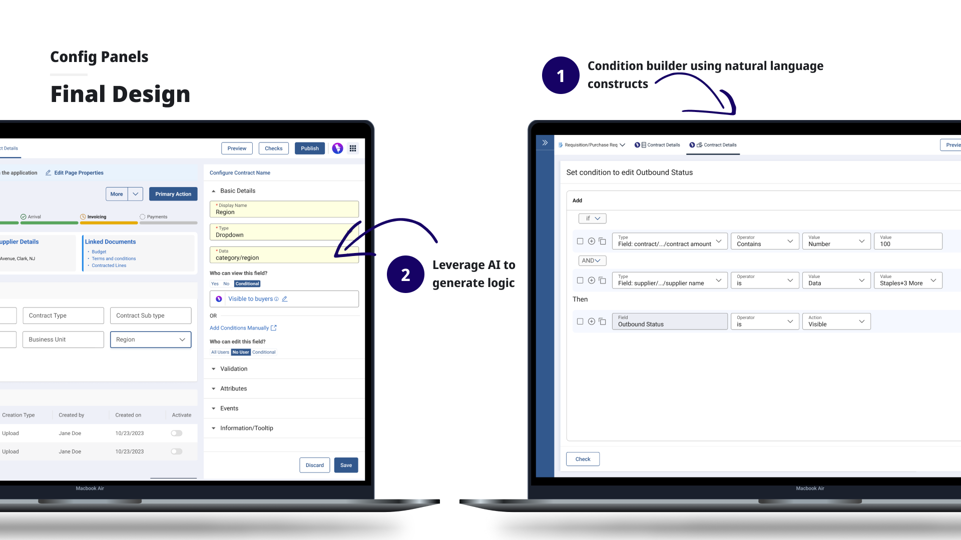
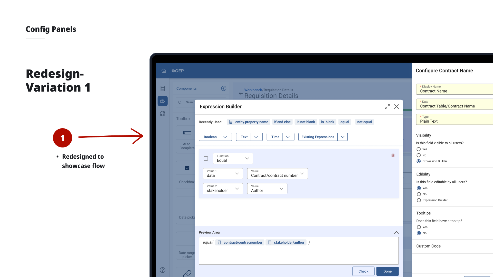
Design Process
Iteration 1 Persona-based home screen
Returning users saw a "pick up where you left off" widget to resume in 1 click. New users saw guided building options and tutorial paths. Added toggleable tooltips and replaced icon-only navigation with text + icon labels. All 6 returning users in testing validated the widget.
Iteration 2 Reducing cognitive load
Decluttered home screen: banner replaced full-image background, application cards simplified to name + status only. Working area expanded by modifying navigation layout. Tabs introduced in the header for cross-module navigation without full-page transitions.
Removing jargon
Worked with backend teams to handle legacy architecture terms under the hood surfacing them only in advanced settings, keeping the primary UI clean for all user types.
Outcome
Clients could make and preview changes to their applications in real time with zero dependency on engineering. App creation time down 75%. Support tickets down 80%. Click depth to resume work reduced from 5–6 to 1–2.
GEP
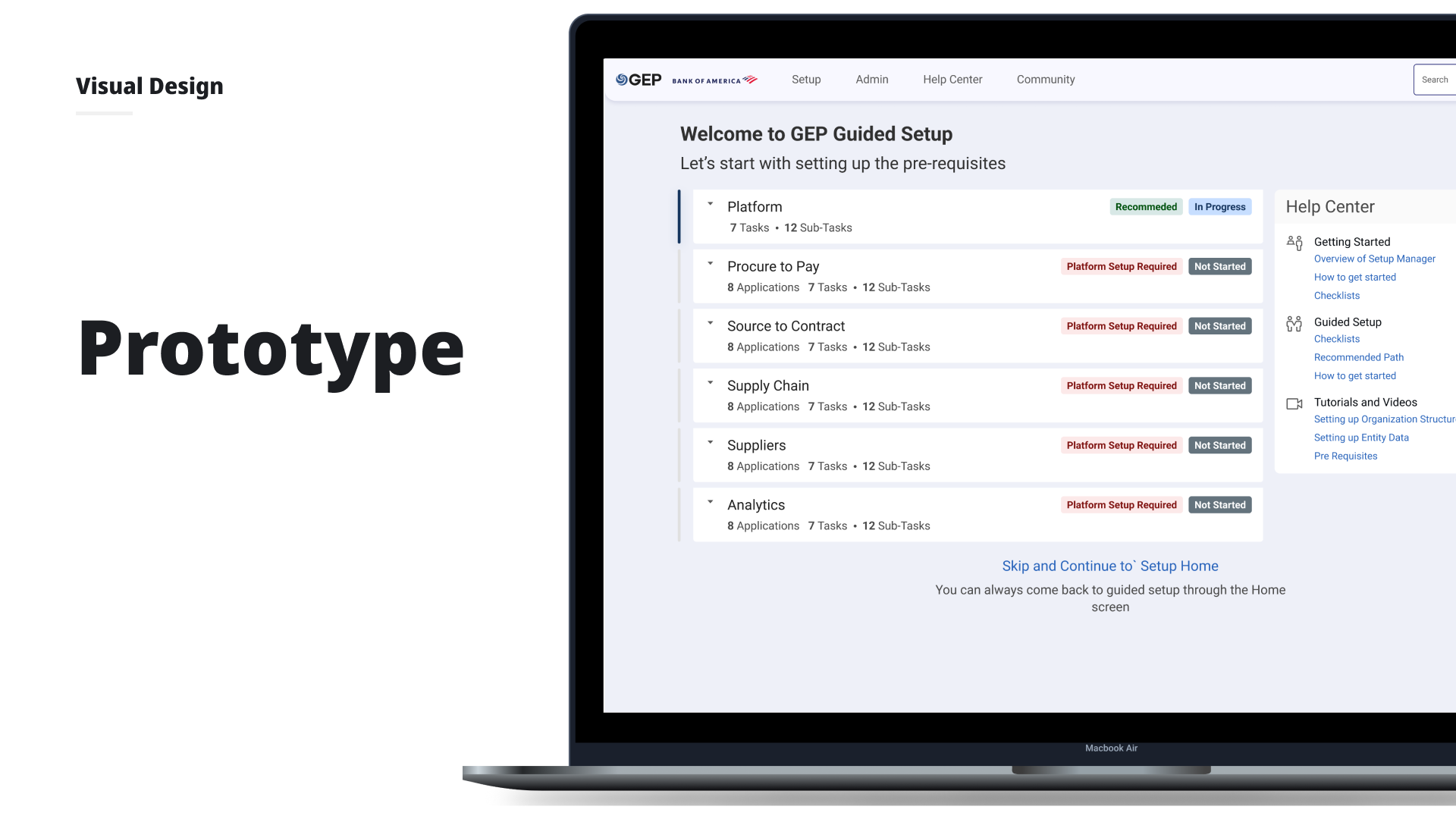
GEP Guided Setup – Setup Time ↓ 50%
Onboarding experience for enterprise clients configuring applications from scratch.
Impact
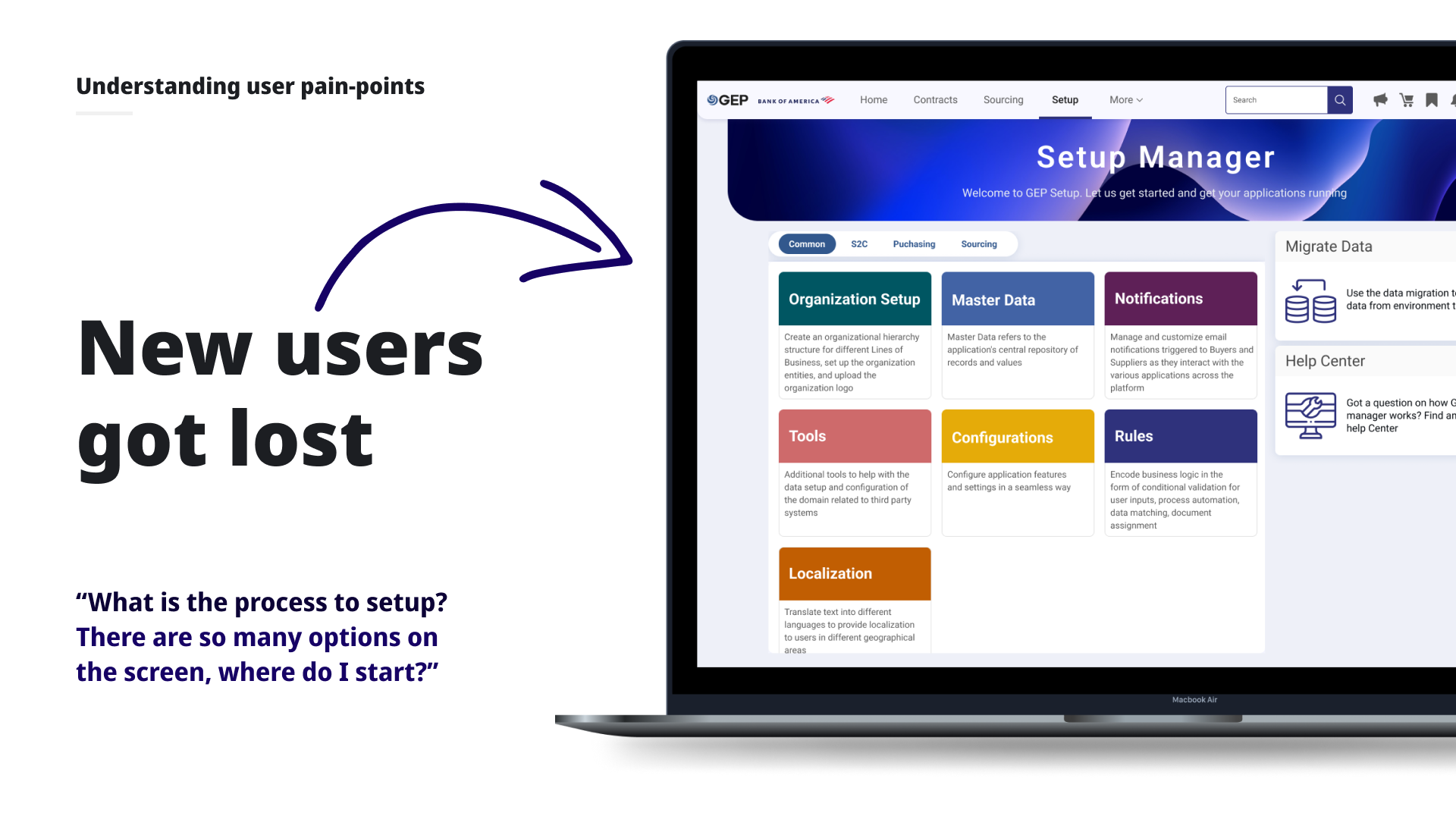
The Problem
Every new GEP client onboarding required setting up an organizational structure, uploading master data, defining rules and workflows, and configuring features across 20+ applications. The process was complex, unsequenced, and opaque. Client support and admin teams constantly needed hand-holding from GEP's product and engineering teams.
"What is the process to setup? There are so many options on the screen, where do I start?"
Research
Discovery Workshop
A 3-hour remote workshop with 20+ expert users surfaced recurring patterns: no defined sequence, invisible prerequisites and interdependencies, and constant hand-holding while experienced users were comfortable with the existing screens.
Validation Interviews
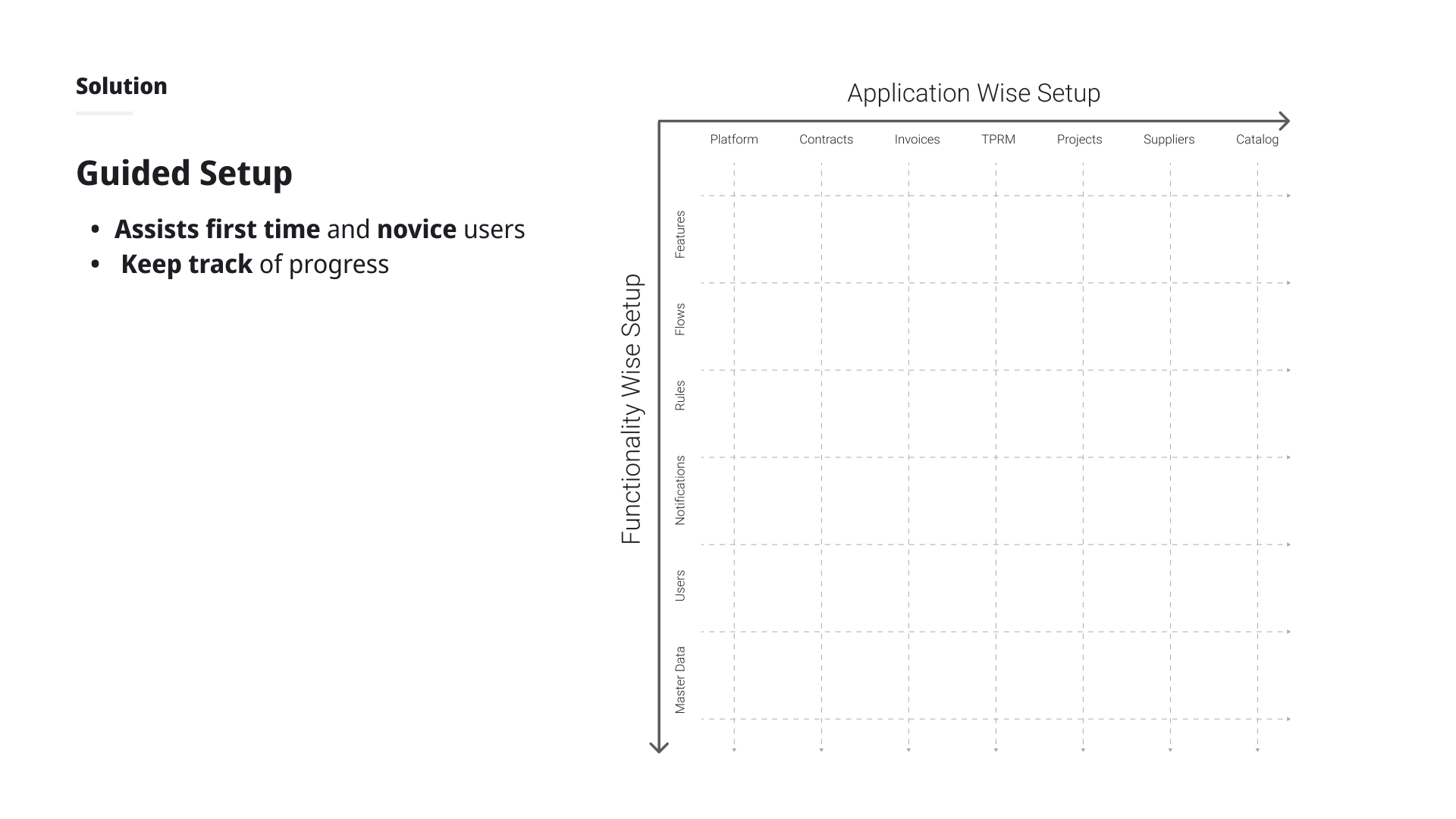
Online focus groups and individual interviews with 15+ experienced internal team members confirmed the real setup sequence: always starting with organizational configuration, then per-application setup, with different go-live dates per app. This validated organizing Guided Setup by application rather than by function.
Design Process
Information Hierarchy
Explored two organizational models by application vs. by functionality. User testing showed strong preference for application-based organization, aligning with how clients actually go live.
Journey-Based Entry
When logging into a new domain for the first time, users choose their path: Guided Setup (for new/novice users) or the familiar DIY home screen (for experienced users). This decluttered the home screen without removing functionality.
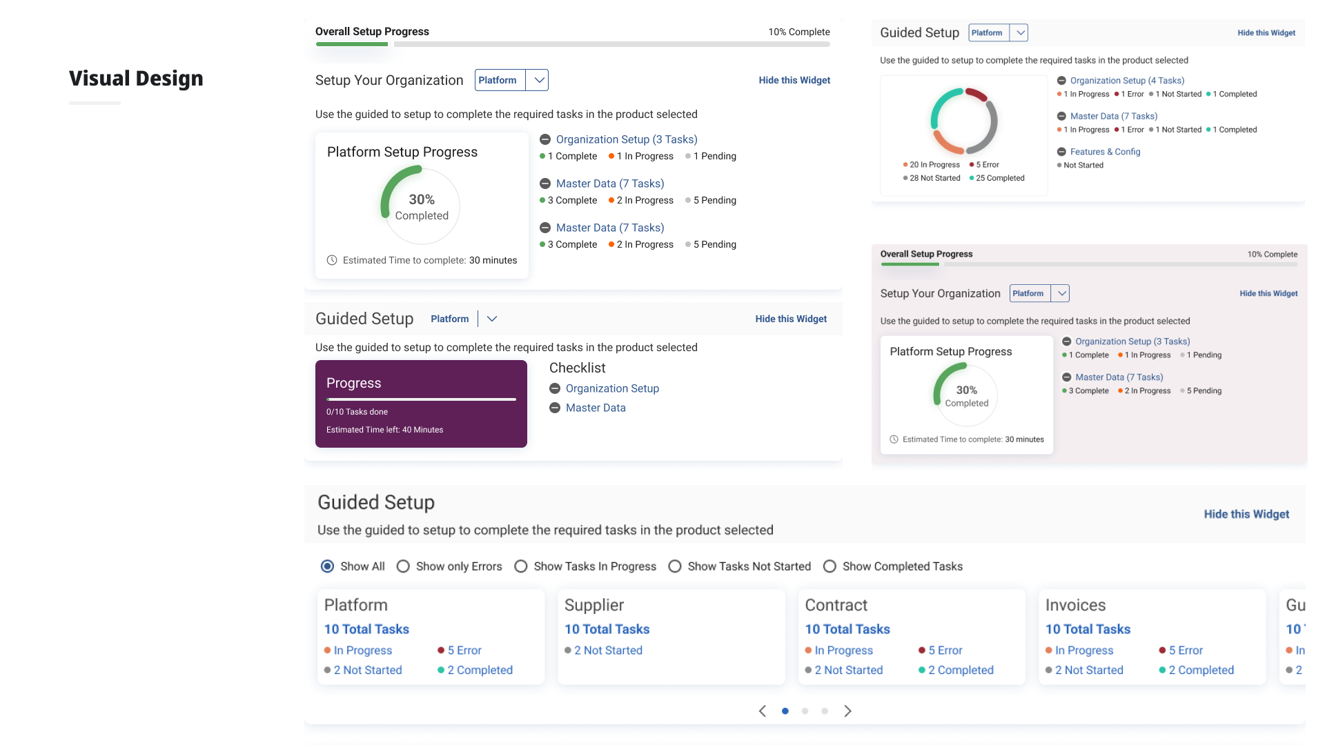
Guided Setup Features
Progress tracking with per-application drill-down checklists. "Next recommended steps" surfaced contextually after each completed item. Prerequisites and interdependencies made visible inline with help content.
What Worked
- Progress tracking and drill-down checklists per application were highly valued by all users
- "Next recommended steps" after completing items was appreciated across new and existing users
- Separation of new vs. returning user journeys significantly reduced home screen clutter
Outcome
Setup time reduced by up to 50%, with significantly less dependency on GEP support and engineering teams. Designs were validated across a mixed group of 12 new and experienced users before handoff to development.
GEP
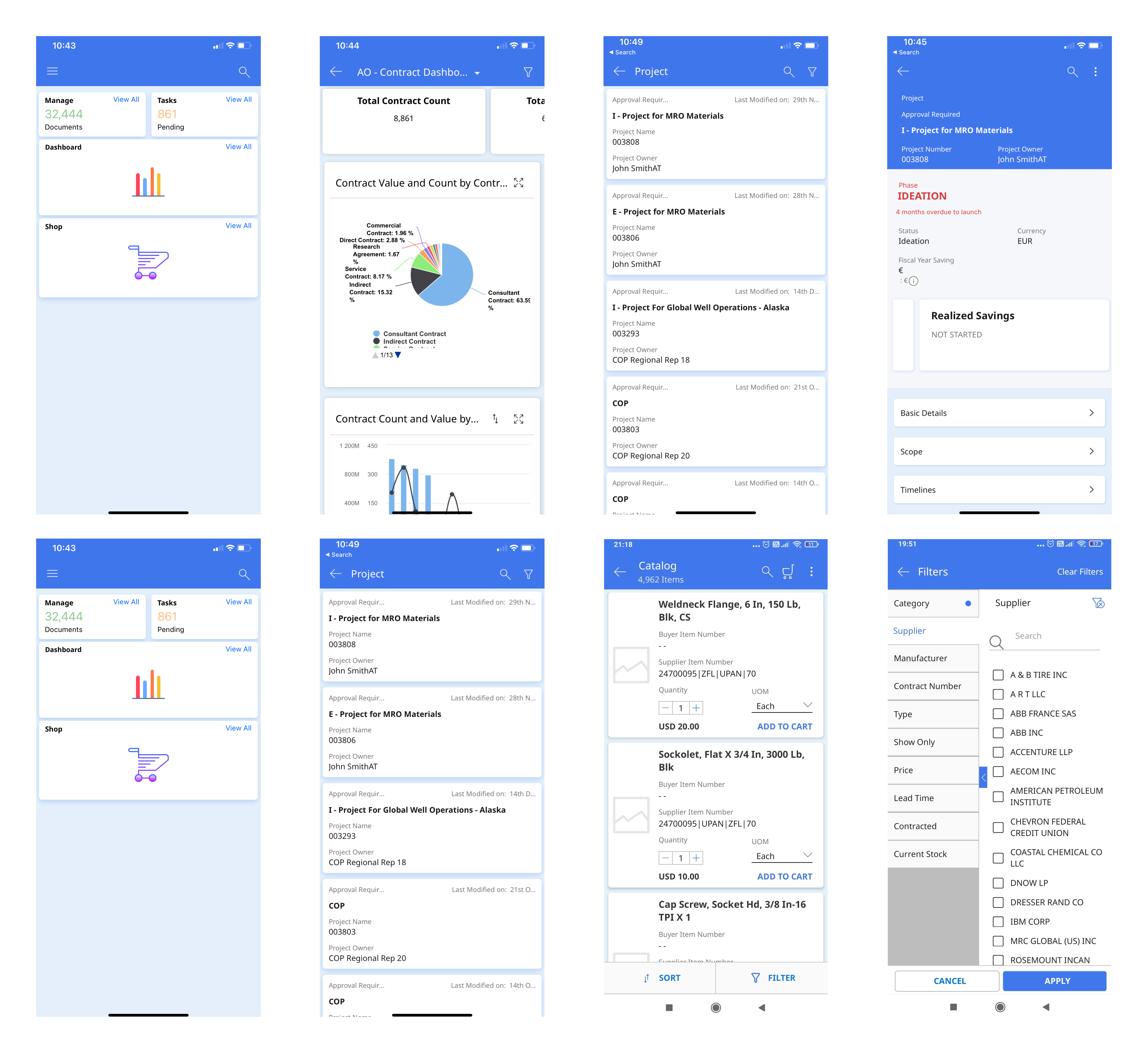
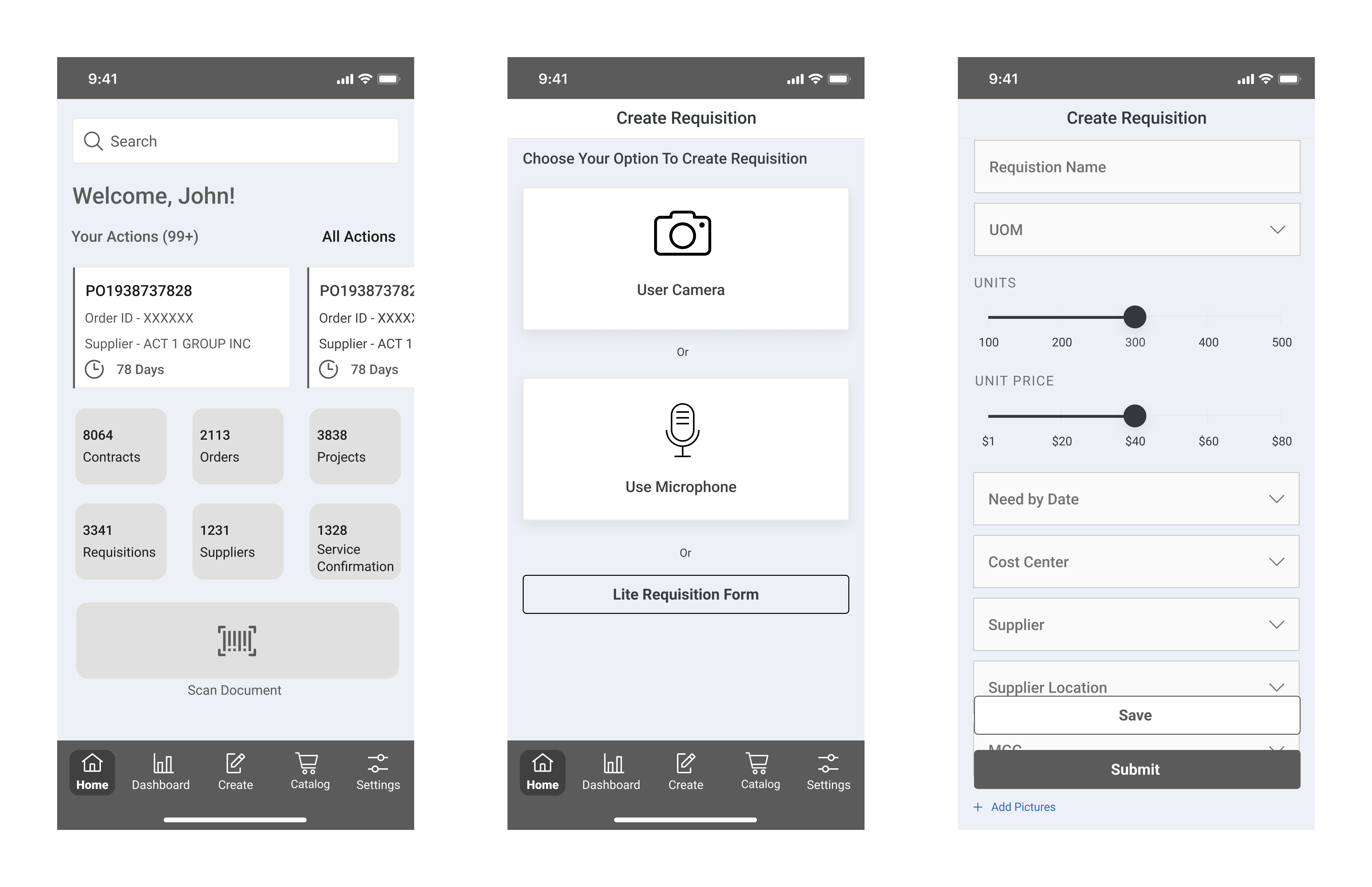
GEP Mobile App – Requisition Creation: 12% Adoption↑
Redesigned the GEP mobile app with requisition creation, cutting approval times by 19% and enabling 4 new enterprise client wins.